Pricing Simulations Analysis - Per Tick Tracing (Less than 5 Minute Runs)
Explainers
We're firm believers in backtesting if possible at Mahi to avoid risk capital if it's not necessary. Learn more about some of the benefits of simulations here
This article explains how to interpret a per tick pricing model simulation. This is a Compass Pricing customer only service.
Analysis (Less than 5min Backtest)
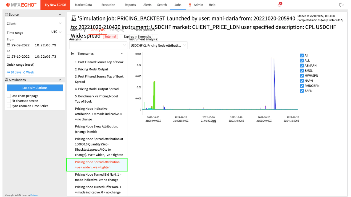
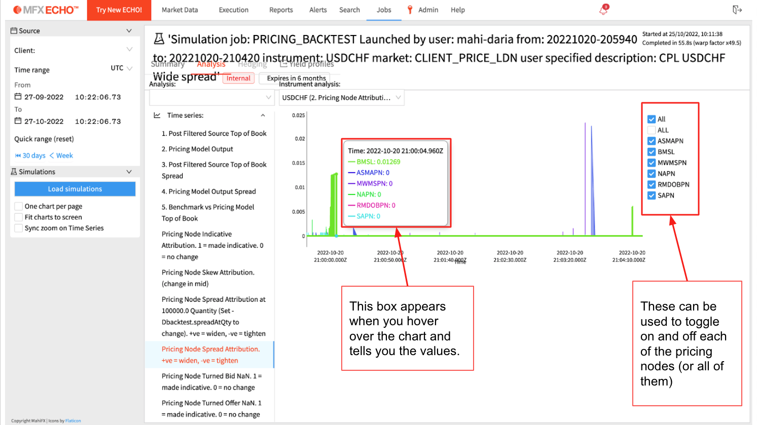
Two charts we use often are Pricing Node Spread Attribution and Pricing Node Indicative Attribution. These charts show which pricing nodes are responsible for the pricing models spread and which are responsible when it goes indicative during the time period the backtest was run for.
Pricing Node Indicative Attribution
Pricing Node Skew Attribution 

Analysis
The Pricing Node Spread Attribution chart shows how much each pricing node was contributing to the spread of the model. Once it’s clear which node/s contributed to the spread, the config editor in Compass and TOB in Echo can be used to figure out why. The same applies to the Pricing Node Indicative Attribution chart.
Where common nodes are configured:
BMSL: pricing > benchmarkMinimumSpreadLogicParameters
ASMAPN: pricing > antiSpoofingMovingAverageParameters
MWMSPN: pricing > marketWidthMinimumSpreadParameters
NAPN: pricing > arbProtectionParameters
SAPN: Excel import through flex dashboard (usually done by Mahi)


